A "biography" logging pattern and a curious case of troubleshooting long request times
After reading this post you will know the “biography“1 logging pattern, how to use the biography and how useful it can be, backed with a real-life example. I personally find the biography to be a simple yet powerful tool to profile and troubleshoot deployed code.
A “biography” logger is basically a dictionary with a well-defined life cycle, logged at the very end of its life cycle. For example, for a web application, this life cycle would be a web request, and for an asynchronous job (e.g. a Celery task), the life cycle would be the duration of the entire task.
One of the functionalities that we build at Airspace Intelligence is a web application that delivers weather data to the user as images (slippy tiles) on a situational map. Let’s focus on this weather web app example and images delivered as the rasters. Everything that follows happens on the server side:
- The web request starts, and the “biography” dictionary is empty.
- The server-side code adds the input request parameters to the dictionary, like a zoom level.
- At the very end, the server-side code adds to the biography the total time of the request, and, eventually, logs the biography.
In Python, you could hold the state across its life cycle with a ContextVar. An exemplary biography log line could look like that:
2022-10-25T23:08:00.000 INFO biography_json {"method": "get_image_from_tile_ids",
"zoom": 3, "x": 12, "y": 23", "request_time": 0.234, "run_query_time": 0.134}
You can now collect the bibliography log lines, and with some scripting, process the JSONs, and use common statistics and visualization tooling for insight. I personally use Jupyter notebooks, Pandas to load and query the processed tabular data, and matplotlib for visualization2.
Equipped with the data and the visualization tools, you can plot statistics of request times, or database query time, or correlate times with the request parameters, or with experimental flags. We did exactly that when we were profiling the application.
Below is a concrete example where we were experimenting with where to process the data, in the database, or transfer the unprocessed data to the application (on the server side) and process the data in the application. This experiment lead to uncovering a peculiar bug. We checked two variants:
- clip in database - if it pays off to truncate (ST_Clip in PostGIS) the data on the database side and transfer fewer data to the app, or
- query without clipping - pass the whole, un-clipped weather data from the database to the application and do the processing in the app itself.
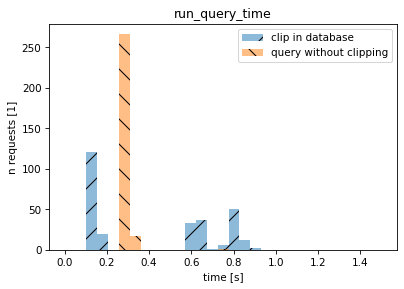
On the histogram below, the horizontal axis is the database query time. The blue “/” bars describe a scenario when the data is clipped in the database and then send to the app, and the orange “\” bars describe the scenario when the raw data is transferred directly to the application without clipping.
d = pd.read_csv("processed_biography.csv", sep="\t")

bins=np.linspace(0,1.50,30)

ii = (
    (d.method=='get_image_from_tile_ids')
    & (d.tile_ids=='[39817, 39683]')
    & (d.z==2)
)

plt.hist(
    d[ii & (d.clip_in_database==True)].run_query_time,
    lw=0, hatch="/",  alpha=0.5, bins=bins, label='clip in database')
plt.hist(
    d[ii & (d.clip_in_database==False)].run_query_time,
    lw=0, hatch="\\", alpha=0.5, bins=bins, label='query without clipping')
plt.xlabel("time [s]")
plt.ylabel("n requests [1]")
plt.title("run_query_time")
plt.legend(loc="upper right")
plt.show()
For the first scenario (blue bars) you see different modes (different clusters of query times) because the amount of data processed by the database depends on which part of the weather the user looks at (if the user view overlaps with the large portion of the area covered by weather data or not). The takeaway is that (i) clipping on the database side can sometimes improve the performance and that (ii) not clipping on the database side is “quite fast” and smooths out the performance characteristics.
Next, we plotted a chart to see what how the request time depends on the query time, and a weird thing showed up. There was no correlation between the query time and the request time:
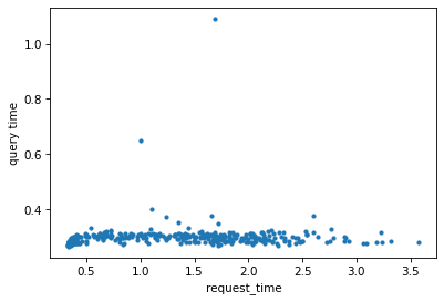
That didn’t make any sense. We dove into the slowest requests, added logging and we found out that we had a bug in the dependency injection code, that instantiated the dependencies once per request instead of once per thread. One of the dependencies was calling another endpoint, failing, backing off, and trying again. The request time was dominated by the random back-off time!
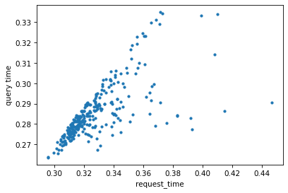
After we fixed the bug, the request time was short and, as expected, dominated by the query time:
Conclusion
Biography pattern is an easy-to-implement and powerful tool that can help you with profiling and troubleshooting. You also learned that raster operations might be faster when done in the application instead of PostGIS, but that is a topic for a different post.
(on HN)
Thanks Lukasz Kukielka and Lukasz Daniluk proof-reading and for editorial comments.
1 I did not invent the “biography” name for the pattern, I stumbled upon that name somewhere years ago. I cannot recall the original source, I would be happy to quote that source though.
2 Worth noting that AWS CloudWatch Logs (for Lambda) automatically parses the first JSON and interprets the JSON fields, allowing querying, filtering, and simple stats and charts.